When creating a custom logo design for your business or product, make sure you keep it simple and in line with your brand personality. In order for your business branding to be unique it is important that your logo design quickly communicates what you do and who you are. The first step is to take a long hard look at your brand image. What words would you associate with it? What adjectives describe your brand? Is it masculine or feminine? Is it strong and mighty, or soft and dainty? Take a good look at the personality of your brand and give it some real concrete terms.
Quick Tips To Get You Started:
- What font type style are you using? Does it feel like your brand?
- What words or adjectives do you associate your brand with?
- Keep your color palette simple. Don’t use more than three colors, making sure your design works well in black & white
- Are you using icons and images in your logo? Keep the drawings simple, linear.
Is Your Logo “Professional & Trustworthy”?:
When I design a brand logo, I look at the letterforms (the shape of the letters and where they lay on the baseline) of the name of the product. The following are key factors when choosing a typeface:
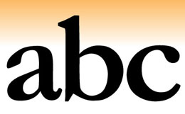
- Ascenders: Tall letters that form above the baseline (ex: “d” and “b”)
- Descenders: Letters that drop below the baseline (ex: “p” and “g”)
- Round letters: (ex: “o” and “c”)
- Straight letters: (ex: “m” and “v”)
When choosing the right font for your brand’s logo design, look for opportunities to personalize your logo. I like to look for letterforms that I can manipulate to make the design more “ownable,” something no one else has, something unique to the brand.
Using a trick:
What is a “trick” you ask? We like to use only one “trick” in a logo. It’s a unique-ness to a typeface. In custom logo designs, when joining two letters in a unique way, that’s called a ligature, or a “trick.” When you use a ligature in printing, it consists of joining two or more letters. Don’t use more than one ligature in a logo- your logo will be too busy and too difficult to read.
I’ve been working with typography for many years and I actually love it. I love looking at the different styles of fonts and working with type to form new and unique logo designs. I love working with the shapes of positive and negative spaces in the letterforms. Most of all, I love it when I’ve picked some great fonts for a particular project, and I start playing around and manipulating them and they start to ”sing”, meaning, they start to come together and look excellent! You’ll know it when you see it….this is the essence of typography in logo design.
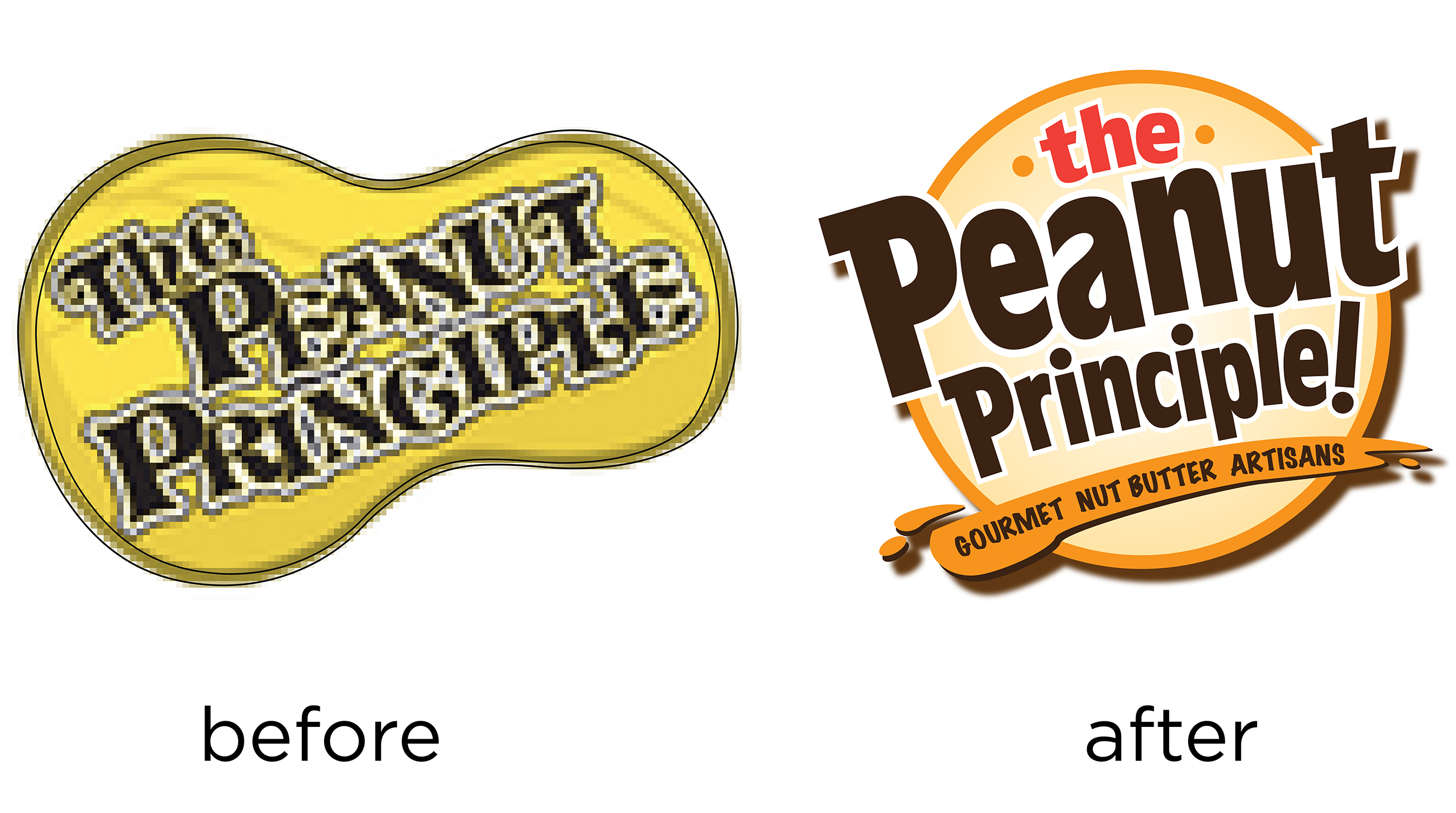
 See the difference in font that we used for our client, The Peanut Principle. The capital “p” we used in the words Peanut and Principle work well in their letter forms. Their new font is now legible and stands out!
Do you need help deciding which font to use for your logo? Contact us for your free consultation.

