We are so excited that our business branding design for blackwlanut is entering the world this week in conjunction with the opening of the 2014 Sochi Olympics. It is a brand we are passionate about and a relationship that started many months ago.
 Our job was to collaborate with blackwalnut, creating a well designed, professional looking brand so that when the spotlight shined on them for their involvement in the 2014 Sochi Olympics, they would present as the passionate, dedicated team of scenic fabricators that they truly are.
blackwalnut is an Emmy award-winning fabricator of scenic environments for television, exhibits, live events and theater. Established 11 years ago by managing partners Jac Gendelman and Mike Van Dusen, blackwalnut has designed and built close to 800 projects on five continents, bringing a touch of creativity and imagination to everything they do.
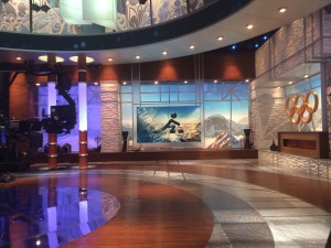 For 8 months, a technical design, project management and build team of carpenters, draftsmen, electricians, laminate and finishing specialists, painters, welders, 3D technicians and two project managers worked on the technical design drawings and construction of the sets from the company’s 44,000 sq. foot fabrication facility, in Valley Cottage, NY. Their goal: to bring Clickspring Design’s elegant vision of NBC’s wrap-around Olympic coverage to vivid life in Sochi, Russia, 2014.
Hudson Valley Graphic Design entered the picture when balckwalnut took a serious look at their own business branding design and how it interacted with potential clients, telling their unique story.
The meaning behind the intriguing name blackwalnut dates back to the company’s humble inception at a kitchen table, when owner Mike Van Dusen looked at his new-found business partner and asked about the huge tree in the front yard. Since that first big project the name blackwalnut has become an industry wide symbol to convey the uniqueness of the customer service they provide and the exceptional product the team of 50 employees produces and transports globally. Through the years blackwalnut has produced such sets as the Jon Steward Daily Show, NFL Draft Stage, Telemundo news set, NBC sports set as well as Broadway theater sets, exhibits and special event projects.
 We partnered with the blackwalnut team, planning a marketing strategy and brand program that would spotlight their unique talent and extreme dedication. Hudson Valley Graphic Design presented several design options, each depicting an aspect of this global company.
We explored various graphic design techniques, such as typography, bold shapes and the use of icons and images. Our colleagues at blackwalnut settled on a design that depicted their unique heritage while conveying a strong brand message.
Font
We chose an approachable yet strong font for their logo design. Tahoma is a type style that has regular and bold weights, is soft and friendly, but when used in it’s bold weight, is perceived as strong and powerful yet approachable.
![]() Icon
Icon
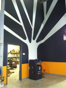
The blackwalnut “tree” is one of unique significance. Based on their own brand story, the tree tells the story of their “roots” while depicting a natural strength and bold presence.
The drawing of the tree is intentionally rough, not polished, but gets the job done…kind of like the blackwalnut team.
If you would like this kind of attention paid to your brand, let’s start a conversation. (914) 582-9353