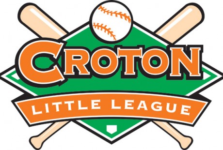
Croton Little League Sports Logo Design
When creating a custom logo design for your business or product, make sure you keep it simple and in line with what your brand personality is. In order for your business branding to be unique it is important that your logo design quickly communicates what you do and who you are.
Here are some quick tips to get you started:
- What font type style are you using? Does it feel like your brand?
- Keep your color palette simple. Don’t use more than three colors, making sure your design works well in black & white
- Are you using icons and images in your logo? Keep the drawings simple, linear.
If you want to be perceived as professional & trustworthy, your logo design has to look “professional & trustworthy”.
When I design a brand logo,I look at the letterforms (the shape of the letters and where they lay on the baseline) of the name of the product. The following are key factors when choosing a typeface:
- Ascenders: Tall letters that form above the baseline (ex: “d” and “b”)
- Descenders: Letters that drop below the baseline (ex: “p” and “g”)
- Round letters: (ex: “o” and “c”)
- Straight letters: (ex: “m” and “v”)
When choosing the right font for your brand’s logo design, look for opportunities to personalize your logo. I like to look for letterforms that I can manipulate to make the design more “ownable,” something no one else has, something unique to the brand.
Using a “trick”
We like to use only one “trick” in a logo. What’s a “trick”? It’s a unique-ness to a typeface. In custom logo designs, when joining two letters in a unique way, that’s called a ligature, or a “trick.” When you use a ligature in printing, it consists of joining two or more letters. Don’t use more than one ligature in a logo- your logo will be too busy and too difficult to read.
If you’d like a free evaluation of how your logo is looking these days, let us know! Contact us for your free consultation.
