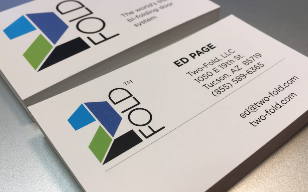
Ed Page is an creative entrepreneur, and imaginative inventor and a heck of a swell guy. I met him at a Westchester Business Council Networking event. We were sitting next to each other when that guy from Shark Tank was giving his presentation. Afterwards Ed and I exchanged cards, as he told me of his need for a branding expert for his new product launch.
After meeting with Ed and partner Roger Braman, we formed a solid strategy of launch and growth. A logo design, printed brochure and WordPress website was what was needed before we launch an all out digital campaign to tell the worked that 2Fold is here.
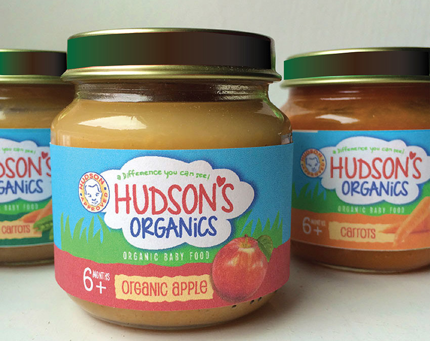
Client Caroline Eromo found us online when she was searching for a branding agency to help her with the launch of her organic product line, Hudson’s Organics, named after her first born, Hudson. We presented several design options for Caroline and she chose an upbeat whimsical design for her product line’s package design.
In growing her business, Caroline expanded her organic product line to include ready-made meals named Hudson Plate. We created a logo design that felt like part of the full brand program.
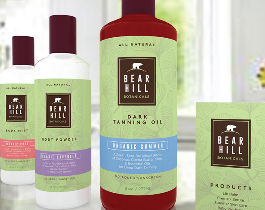
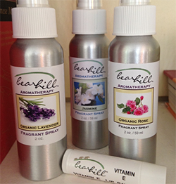
The industry of organic products has exploded in the past 10 years. The consumer is savvy and diligent with their product choices. Our client, Jenna Amundsen of Bear Hill Botanicals came to us with a line of organic products that she makes herself. Having designed her own labeling several years ago(see left), she was ready to take her product line to the next level and came to us to design a line of consumer packaging that was both appealing and organized as she carries several varieties of body care products.
At a local Farmer’s Market, we met Joe Campagna, founder of the Peanut Principle,a gourmet & diverse line of Nut Butter products. After sampling several flavors, we were extremely impressed with the tastes, textures & uniqueness of Joe’s products. WOW! … we exclaimed & we proceeded to inquire as to how Joe’s brand was performing?
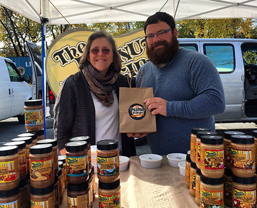
The Peanut Principle is not only sold locally at Farmer’s Markets, but has been successful enough to make it to the store shelf in notable locations such as Whole Foods & Mrs. Greens. So … Joe indicated that business was pretty good, but he did have a branding problem.
So, what’s the problem?
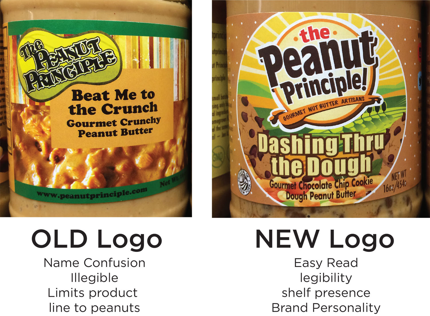
The Peanut Principle brand mark was confusing, not easy to read & lacked shelf presence. Hudson Valley Graphic Design understands the importance of brand presence in the marketplace & how to position brands to not only be noticed at shelf, but also tell a Brand story. No matter how good your product is, the need for having a positive brand impression is critical. Currently, The Peanut Principle lacked one & in a sea of competitors, needed to break through and have a point of difference.
After consulting with Joe on his brand personality & attributes, Hudson Valley Graphic Design provided a wide range of concepts for Joe to analyze & ultimately select. It was a tough choice for him, as HVGD’s solutions all have a distinct Brand story behind them.
The Winning Result Increased Sales
The winning result was a strong bulls-eye graphic that showcased The Peanut Principle brand name in a “stamp of quality” fashion. The rich, dark brown coloration of the logo face portrays naturalness & the “east to read” letterforms create maximum brand impression. The playful, jogged letterforms jump off the clean bulls-eye shape, breaking out & making a bold statement, yet displaying the sense of a quality product that consumers can trust.
The logo face is underscored with a graphic splash of peanut butter, reinforcing its product proposition & making the expert claim of “Gourmet Nut Butter Artisans”. This was a benefit call-out that was never leveraged before. Now, consumers can appreciate that time, care & quality ingredients went into the making of The Peanut Principle product. On pack, the new logo is prominently positioned front & center, surrounded by a tasty visual and fun & quirky flavor names. The strong branding unifies the many flavors into a cohesive family that is shoppable & noteworthy.
As the new look for The Peanut Principle has rolled-out, it not only has great brand impression at shelf, but separates itself from competitors with a new brand story…Local, gourmet, artisanal, fun & the experts in the Nut Butter experience!
Clients come to us because they know they need help in the “graphics” department. All business owners want their company to grow. We often work with clients who designed their own logo, but now that their business is taking off…want to upgrade to a more professional look, to be taken seriously. Sometimes, what they don’t realize is the vast world of business branding available to them and the potential unique, own able graphics can have on their success story.
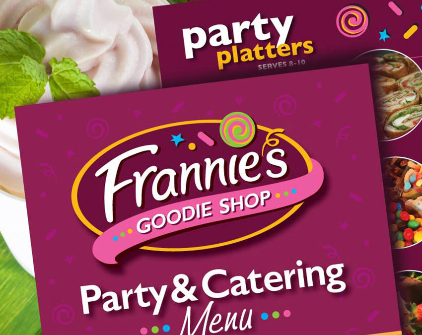
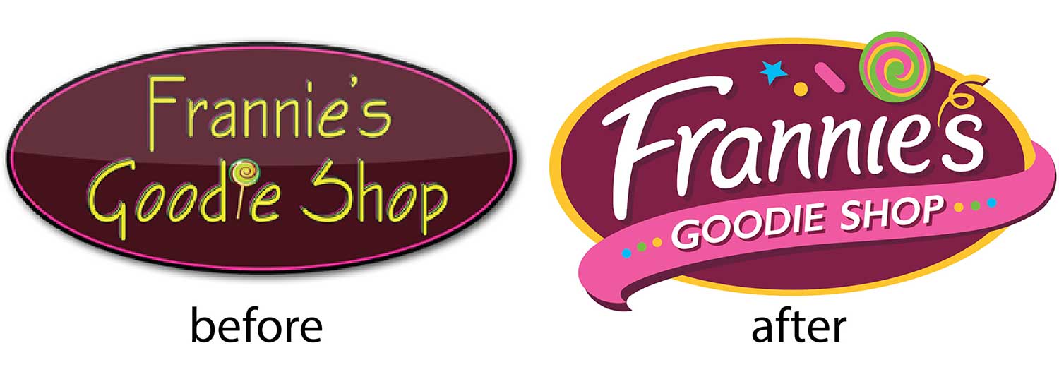
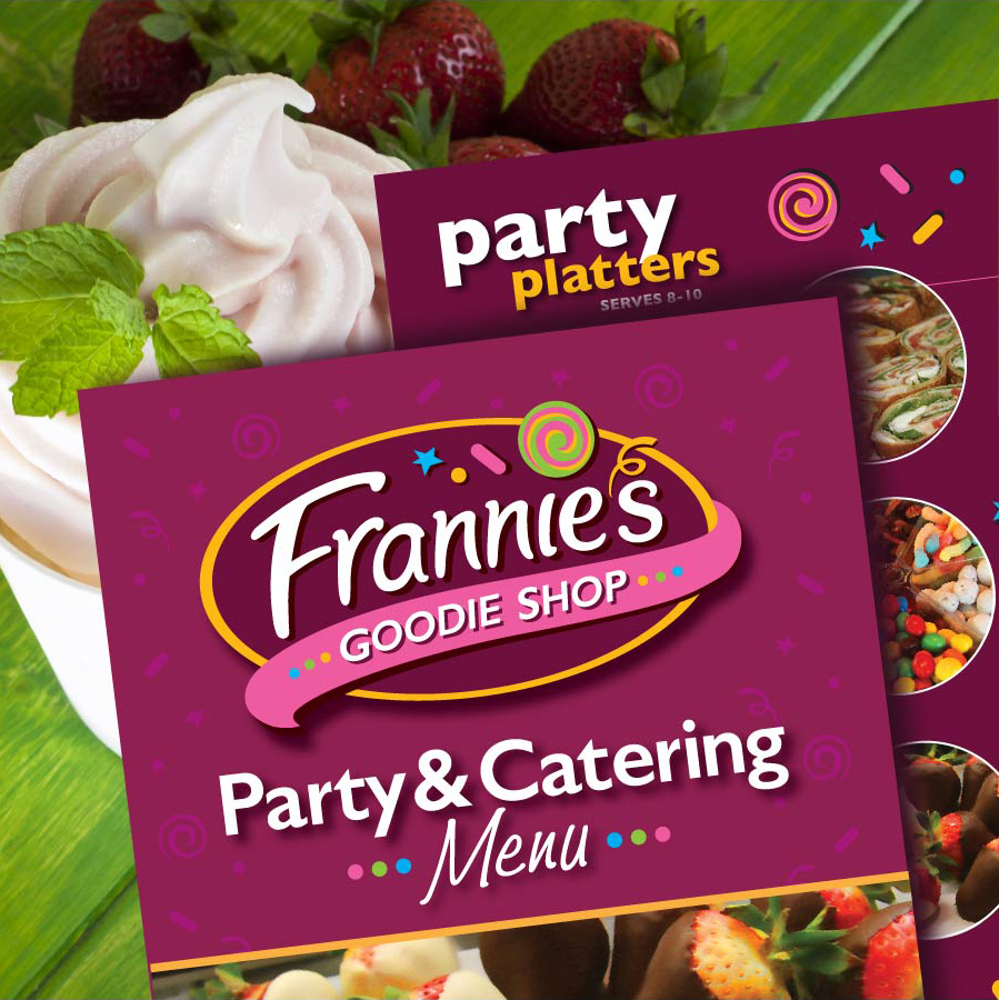
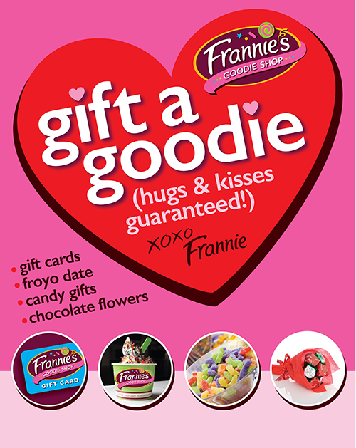
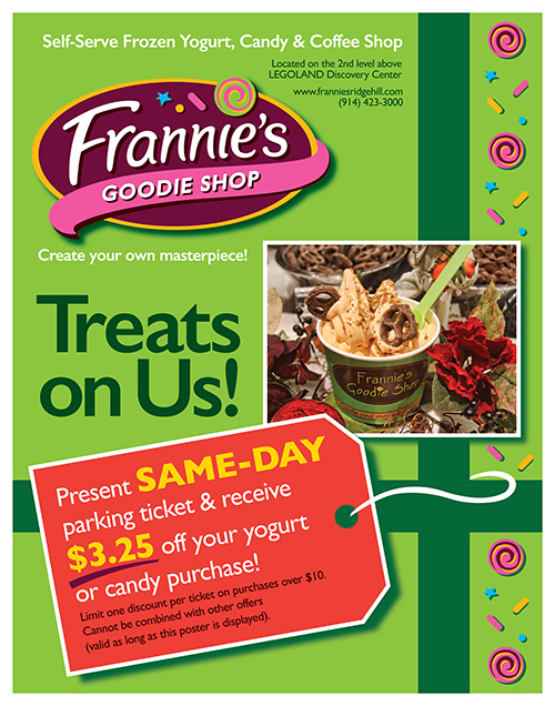
We were careful to respect the logo design equities already established, like the oval shape and color palette, finding that it was important to create a brand personality that truly embodies what Frannie’s Goodie Shop is all about, not just a yogurt shop, but an event!
Let printed materials support your brand personality!