WordPress Website Design

WordPress Website Design

Tompkins Excavating is a woman-owned, family operated residential and commercial excavation/landscape construction company with more than 30 years experience of taking our clients´ visions and transforming them into reality.  They came to us in need of printed sales collateral and an updated website design New York

We created an impressive sales media kit along with a fully responsive WordPress website.

Website Design & Development

Website Design & Development

Premier Learning Centers in Pleasantville, NY has a unique message:

Every child matters. Every child has strengths. Every child has a right to have their education feel right and fit right. Every child deserves to be understood for who they are.

We designed a responsive website for our client Toni Tarnell that would get that message across showing the support givien through encouraging photos and copy content.

Brand Strategy for Hendrick Hudson Free Library

Brand Strategy for Hendrick Hudson Free Library

Hendrick Hudson Free Library NEW Brand Look!

Jill Davis, Director of the Hendrick Hudson Free Library approached us to rebrand the image, personality & tone of the Hendrick Hudson Free Library with the objective of “reaching out to more people”. They needed a brand strategy to move forward. Awareness of the Library & all of its wonderful Community activities could improve. With so much to offer beyond traditional libraries, how could we connect to this Community in a new, fresh, exciting way – getting the message of HHFL out?

Hudson Valley Graphic Design is an expert in creating brand connections with people through optimal visual & verbal communication. A Brand Program that identifies with this Community & unifies all of HHFL’s many offerings became our mission.

Our first step was to take a look at how their brand looked today, how their message was currently getting out.  We presented our client with a brief visual overview of their present brand persona.

Brand Strategy Session

Through a thoughtful & inspirational brainstorming session with Jill & key leaders of the HHFL team, we collaboratively drew out ideas that would achieve this vision for the future. Multiple solutions, with range of rationale, were created for the team to analyze & ultimately select. This is a testimony to our belief & values in closely working with our clients & forming strategic partnerships.

We enjoyed a fun morning sharing ideas and input.  All ideas are valid and welcome at our strategic brainstorming sessions, complete with worksheets and other surprises!

New Brand Look!

It was an obvious, winning solution when the entire team was unified in choosing a clean, modern system that built off the concept of growth, diversity & possibility. The branded look that achieved this builds from a key brand hub – HHFL’s initial letter “H”, which became a brilliant green icon that houses a free-form vine of moving leaves.

This positive image & coloration symbolized the concept of potential growth for all individuals and the positive association of HHFL’s outreach & resourcefulness to the Community. With the extended vine (service & support) & the abundant leaves (offerings & activities), the new visual identity completed the connection desired by HHFL. A strong HHFL logo-mark integrates with all of this, exuding the confidence & trust in a very professional Library organization.  Your Logo design is your brand’s key communicator.

A Visual System

Complimenting the core icon “H” & its vine are a series of vibrant, multi-colored offerings with unique & fun motifs identifying HHFL’s offerings in easy-to-navigate mastheads. This ranged from Adult, to Teen, to Kids and beyond. HHFL has something to offer for everyone, all unified under one house, but with distinct personality for those audiences.

This Brand Visual System holds together as a family of offerings that are memorable, appealing & relevant to the eye of today’s on-line audience, establishing HHFL as the leader in contemporary Library offerings to local Community & beyond. Future growth for HHFL and the diverse Community it serves is bright & filled with opportunity & innovation.

Like what you see? We can help you build your brand just like we did for these folks. If you are interested in discussing...

Local Fresh Food Hall

Local Fresh Food Hall

A Dream Come True…

Early in 2014, Isi Albanese approached Hudson Valley Graphic Design to help him rebrand his Italian restaurant – Bellizzi. Bellizzi is centrally located on Main Street in Mount Kisco and has been a staple, eating establishment in the community for close to 20 years. The restaurant not only offered Italian cuisine and dining, but also take-out pizza and an ice cream & gelato bar. Half of Bellizzi’s space also included a kids’ arcade for parties and playtime space while parents dined. Bellizzi was well loved in the community and Isi established himself as an active, trusted and caring businessman in Mount Kisco.


The Italian restaurant / pizza & entertainment model, however, became dated for Isi and a new vision for today’s eating & social experience clearly came to him. Being inspired by communal, but high end eateries like that of Mario Batali’s Eataly and Gotham Market in New York City … Isi desired to bring that food experience to Mount Kisco. His dream… to launch the very first Local Fresh / Food Hall in Westchester. And this food experience would be more than Italian. Instead, Isi would feature food offerings from diverse cultures & ethnicities … sushi, barbecue, gourmet pasta dishes & wood-fired pizza, charcuterie & fine cheeses … all made on premise by expert chefs, with only the freshest, high quality ingredients … grown & procured locally. And what would pair better with all of this culinary excellence than local, crafted beer, fine wine, and coffees.

After considering different names for this venue … the EXIT 4 brand was born. EXIT 4 being a play off the local exit from the Saw Mill Parkway, but also capitalizing on the “hip / catchy” nature of the name. When Branding expertise was needed, Isi called upon Hudson Valley Graphic Design, a local Design & Marketing agency with many years of NYC experience. Janeen Violante & her team created several inspirational / brainstorm sessions to aid in capturing Isi’s vision for EXIT 4. After very considered design development, HVGD presented Isi and his partner, Jeff Friedlaender, a wide range of concepts to choose from. The Branding presentation included logos, storefront signage, menu covers & business cards. The Saturday morning meeting was an event, taking place on-site at Bellizzi with a host of people with a passion for EXIT 4: family, friends, employees, and of course … Isi and Jeff. Everyone was truly impressed, even overwhelmed with the breadth of creative, but a clear winner was selected!

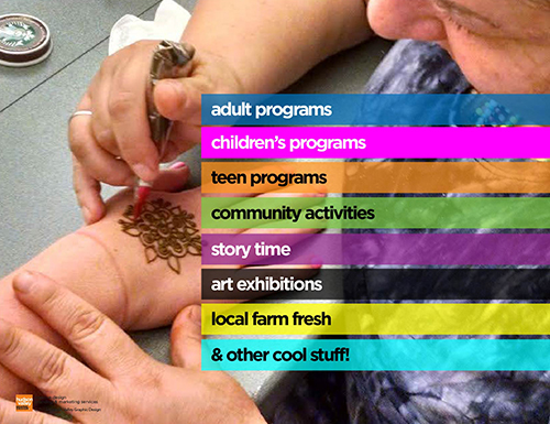
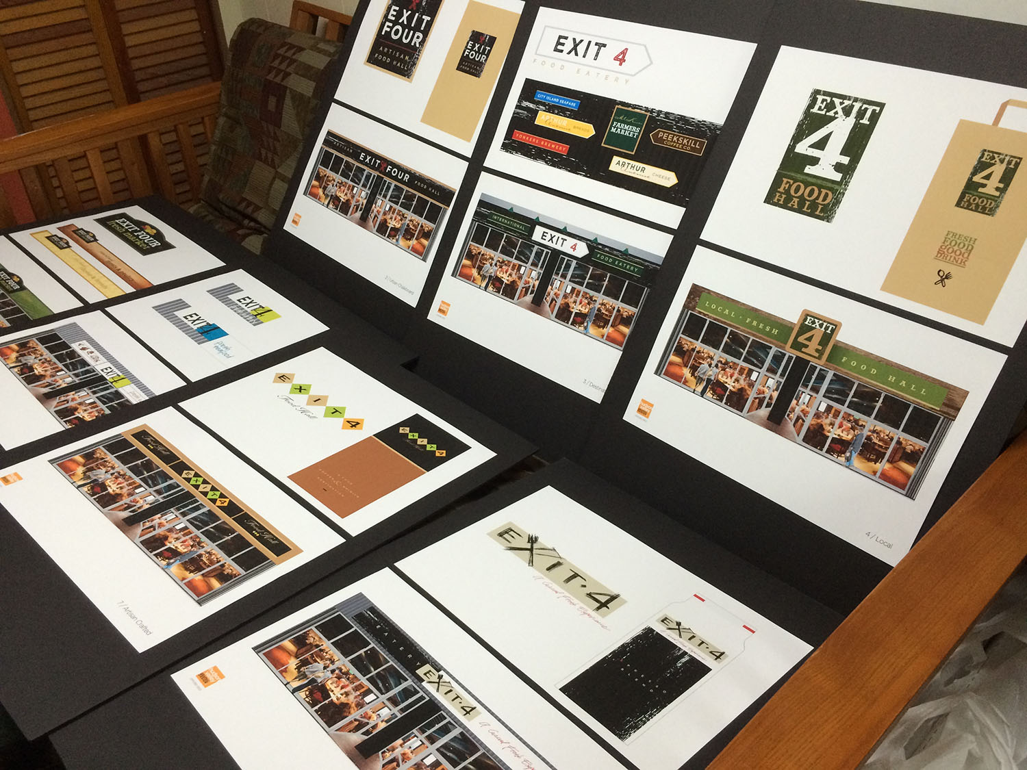
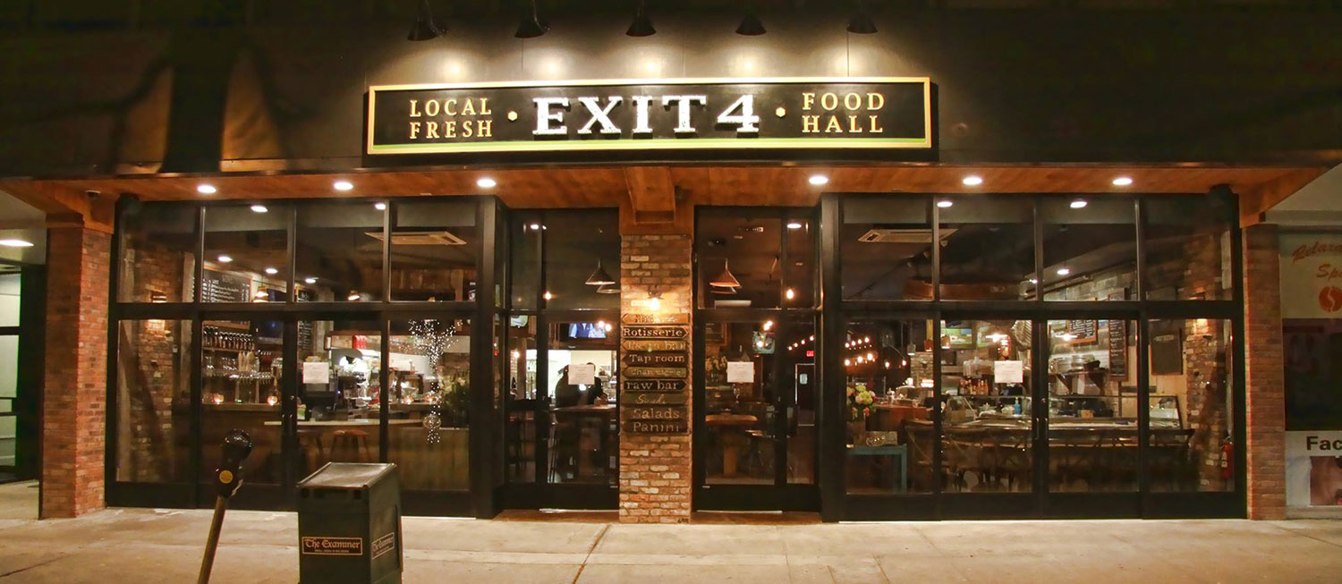
The logo motif would have a very authentic appeal, with bold letterforms that were rugged and hand-cut. The numeral 4 was emphasized for impact, becoming a strong icon for Brand recognition. The letterforms would “pop-out” in white from a black background as if they were hand-written on a chalkboard. All would be encompassed by a thick wooden border, with a healthy green underscore. The textural translation of graphics to surfaces would further capitalize on chalkboard, wood, and craft paper. The overall brand would feel warm, welcoming, authentic, and crafted. Ultimately, this was the vision for the “local / fresh” Brand personality that Isi envisioned. This branded look & feel wood manifest itself throughout the interior of the EXIT 4 eating experience with seats, tables, walls, and floors crafted from rugged wood, stone, wrought iron, and tile… while being comfortable and inviting. Communication of food offerings would be hand-written on chalkboard menus. Guests would easily order at different food stations and sit wherever comfortable, either with family & friends … or encouraging the social aspect of meeting others.

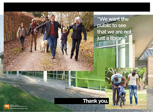
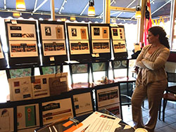
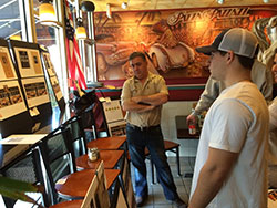
Our client’s goal? …Not only to provide local / fresh, exceptional food, but to create an authentic & casual eating experience, bringing people together in a communal way … to celebrate food, enjoy each other, and create great memories!