The following is an article written by JOSEPH BARBERIO—
A small business’s image can be one of the most important factors determining whether it will sink or sail. Think about it: What is the first thing potential customers or clients see when they look at a product or website? It’s the logo of the company, and a poor one can lead to a costly loss of business.
That is why graphic designers, like Janeen Violante of Hudson Valley Graphic Design, work to rebrand small businesses and update logos—because first impressions can be crucial.
Violante, armed with a degree in communications design from the Parsons School of Design, launched Hudson Valley Graphic Design (HVGD) in Croton-On-Hudson in 1991 to offer small business owners specialized services in logo design, website design, package design, and print and social media management. You might call her a small-business image consultant. But it begs the question, how do you know if your small business has an image problem?
 According to Violante, there are several ways to determine if a company is in desperate need for a new logo. Some of the signs include if the logo is inconsistent across different locations, if it is disorganized, if the logo doesn’t accurately represent the company’s brand personality, or even if it is simply old and hasn’t been updated in many years.
So what makes a good logo? In short, personality. Says Violante, “We explore typography, color, and icons to best represent businesses’ brand personality and what story they want to tell. Every brand has a personality—our job is to create a visual representation of [it].”
Recently, HVGD worked with three local small businesses to redesign their logos and build better brands.
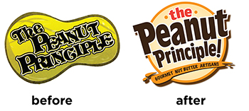
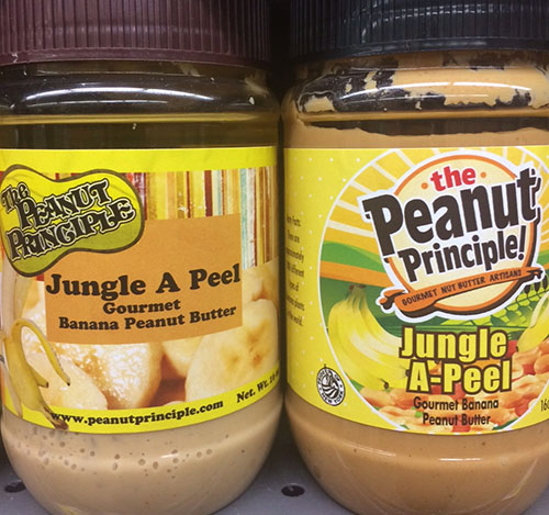
For Hudson Valley-based Peanut Principle, the goal was to create a logo that was clearer and easier to identify. “The Peanut Principle’s logo was hard to read and lacked shelf impact—people didn’t know the name of the product,” says Violante. “We made their logo much more legible by using upper and lower-case lettering in a fun, upbeat font, all representing the fun nature of the Peanut Principle brand.” Improved “shelf-impact” is a key component to juice expansion plans.
 As a new company, Connecticut-based Honeypie’ Recipes hadn’t quite found its visual identity.
“We gave [them] a wide range of unique options, as she was open to a creative solution to brand her new business,” according to Violante. “The only thing she was sure of was the color palette. She wanted turquoise and brown.”
 Westchester-based Rick Sammon Photography is an example of an established business that needed a redesign. Sammon wanted to mesh the many aspects of his business into a rebrand.
“He had an email list, gave amazing photography workshops internationally, and has a huge social media following.” Violante said. But, she added, “he was unsure of how to harness all of the components of his various business offerings. We strategized with him, coming up with the solution to create an umbrella brand ‘Rick Sammon Photography’ that all of his services would fall under.”

