When creating custom logo designs for your business or product make sure you keep it simple and in line with what your brand personality is. In order for your business branding to be unique it is important that your logo design quickly communicates what you do and who you are.
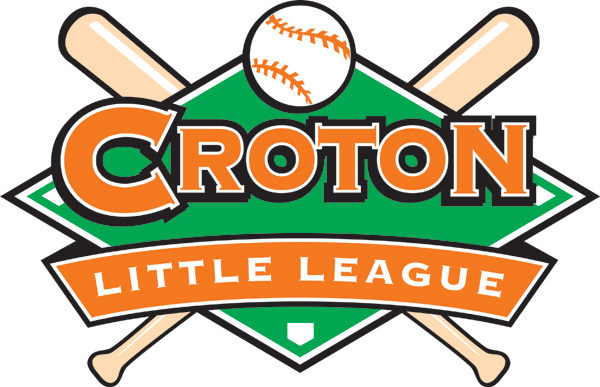
- Keep your color palette simple. Don’t use more than three colors, making sure your design works well in black & white
- Are you using icons and images in your logo? Keep the drawings simple, linear.
- What font type style are you using? Make sure you are using unique colors and fonts.
If you want to be perceived as professional & trustworthy, use classic fonts and simple clear icons when designing your logo
When I design a brand logo, I look at the letter forms of the name of the product. Are there more ascenders (letters like “d” and “b” that have a tall letter form that “ascends” the baseline) or descenders (letters like “p” and “g’” that drop below the baseline)? Are there more round letters, like “o” and “c”, or straight letters like “m” and “v”? All these are key factors in the typeface I choose.
When choosing the right font for a brand’s logo design, I look for opportunities to personalize my logo. I look for letterforms that I can manipulate to make my design more “ownable” something no one else has, something unique to my brand.
We also like to use only one “trick” in a logo. What’s a “trick”? It’s a unique-ness to a typeface. In printing, a “ligature” is character consisting of two or more joined letters. In custom logo designs, when you join to letters in a unique way, that’s called a ligature, or a “trick” Be careful not to use more than one per logo..otherwise, your logo gets too busy and hard to read.
If you’d like a free evaluation of how your logo is looking these days, let us know! Contact us for your free consultation.

