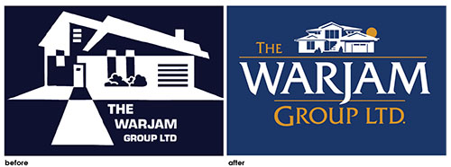
When our client came to us with the business branding design on the (below) left, he stated that he wanted to update his branding to something more “high end” more contemporary. He wanted his new logo design to convey, “we are moving forward” with the newest technology in the construction industry and we take extreme pride and integrity in each job.
Bill is the owner of a very successful construction management company in North White Plains NY. As he described his company, I heard words like “pride & integrity” reliability, quality construction, and teamwork.
Our job at Hudson Valley Graphic Design was to take those adjectives and create imagery that displayed those characteristics.
He already had some equity in his original logo. The house illustration and the dark blue and white palette was something he wanted to hold onto because his customers recognize those visuals. He liked the idea of communicating with the house imagery and wanted us to explore several styles, which we did. His original house illustration was “dated” and seemed “hodge-podge” to some of his customers.
We went to work, researching his competition. We took a look at all the construction management companies in the greater New York area and throughout the country as well. It’s always important to see what your competitors are doing…what works and what doesn’t. This is our first step.
The first issue we had with Bill’s original logo design was “priority” issue. Who is the “star “ in the original logo? The house or the name Warjam Group? This was an issue that needed to be addressed. In business branding, It is important that your customer know your name, I this case, the priority was flipped. The house was the “star”, and the name Warjam was secondary. We decide to change this, making The Warjam Group the “star”, and the house illustration secondary.
In the graphic design process, we explored font styles that are tasteful and credentialed. His “before” font style was too “blocky” and clunky. We decided to use the font Fritz Quadrata in a medium weight to communicate his brand personality.
We presented several illustrative house drawings in simple bold line drawings. Notice the house illustration he chose is a straight–on view of a contemporary home with simple vertical and horizontal line work. The addition of the sun rising over the rooftop subliminally suggests, “we are new, innovative and cutting edge” in each job we engage in.
We kept the blue and white palette but added a dark gold color for accent, which gives “life” to the overall design.
The new logo design for The Warjam group suggests quality construction, pride & integrity, cutting edge, moving forward construction management style, which is the brand story of Bill Riehl’s company The Warjam Group LTD located in North White Plains, NY.
For more tips on business branding, download our Tips4Biz ebooklet here!

