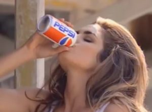
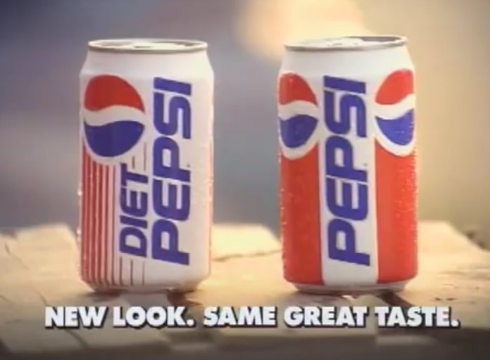
It was the chance of a lifetime. I was working at a high-profile branding agency in NYC when the account came in. The Pepsi-Cola Company, was interested in a full redesign of their flagship identity, positioning it and it’s brand as a dynamic, trendsetting image that would set it apart from the competition on a worldwide basis. As a graphic designer, winning this competition would mean having your brand literally everywhere. The year was 1991. Using computers in graphic design was a relatively new concept, and a very exciting endeavor as we were all learning and honing our skills on this new tool. I was chosen along with several other designers to create a new look for The Pepsi-Cola Company. As we “hit the boards” and began our design exploration, it was evident that the solution to our client’s problem was a complex one. As the designs rolled out from our studio, there was one obvious winner. The client kept coming back to the design with the vertical Pepsi logo and the red & blue bulls eye iconic swirl, acting as a definitive exclamation mark on the overall package. Although design is always a team effort, I remember that feeling of excitement when I realized they had chosen my design-unmatched by any other in my career. The vertically oriented design was deemed “dramatically new and different”. Researched showed that consumers like the vertical format. This gave the Pepsi base brand the big-name recognition it had lacked on it’s former design. We actually took the word Pepsi out of the icon, and had them both stand on their own…a revolutionary idea at the time.  The can debuted on the widely acclaimed 1991 Super Bowl commercial as sexy model Cindy Crawford popped open a can and sipped down the cold beverage on a hot summer day as two young boys drooled over the sight exclaiming, “Look at that beautiful can!” In an interview, super model Cindy Crawford explains that Pepsi’s motivation was to spotlight their new look. Although there have been variations on the this design to date, the now famous Pepsi stand-alone icon lives on and is recognized globally as one of the world’s most noted brands. What a career privilege it has been to be able to say ”That was my design”.


Very cool story, very strong testimonial on your website. Sweet, (or diet!)
Thanks Steve! I appreciate that! I have had an incredible career, I am so humbled and grateful.
Janeen that is an awesome story and you are an awesome designer!
Thank you so much for your kind words!
When was this design made? As a child I would constantly draw and I loved to show people. With that being said, my cousins husband was the regional President of Pepsi Cola in Massachusetts at the time and I drew this exact design on card board and gave it to him. A couple of years later the design was released by Pepsi Cola. I have often wondered if the drawing that I gave to my cousins husband was the inspiration behind the new design.
Hi Nathan,
I created that design when I worked for Peterson Blyth Associates, a NYC based branding agency. Pepsico (based in Somers, New York) had hired us to redesign the base-brand–which had been on the shelves since the sixties. The year was 1990-91. I remember it well–most of the designs in the presentation were on an angle (like Sprite) and this one had the graphics on a true vertical, which the client (Pepsi) liked, and wound up choosing. I also introduced the icon/ball as a separate element, which, at the time was new and fresh! Are you still designing?