 Inspire, Create, Belong
Your company branding strategy is your golden opportunity to represent the personality of your company. We believe that a proprietary logo brand mark is the most critical component in your marketing strategy. Your logo tells people who you are when you’re not around.
The graphic elements of color, typography and illustration can be combined to develop a lasting impression in your customer’s mind.
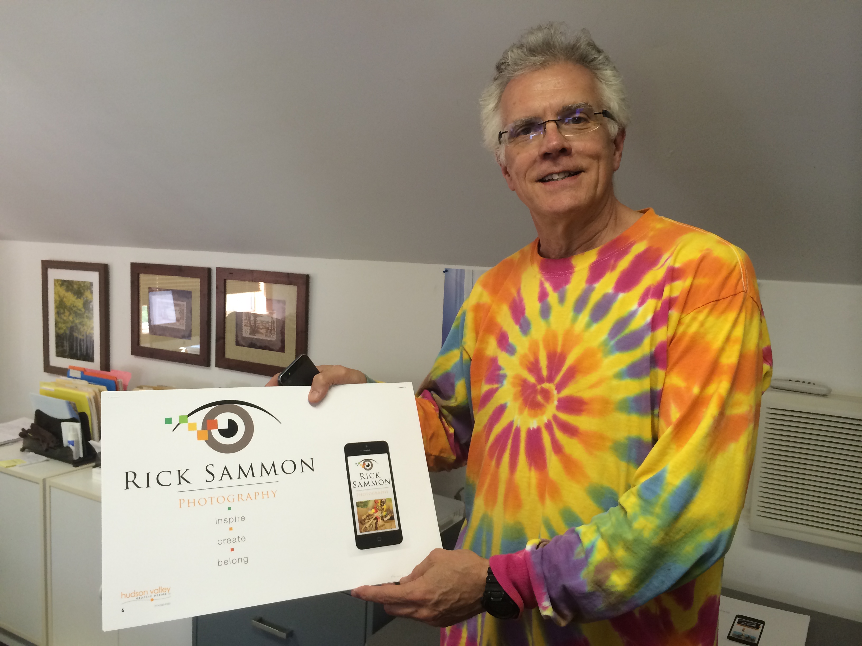
We worked with Rick to unpack his many offerings and determine the most effective “voice” for his brand. After exploring several naming options, our collaboration resulted in the Rick Sammon Photography brand name.
Our next step was to develop a graphic representation for his company, a logo design for his company.
The chosen font was Trajan, a strong and sophisticated typeface that shows elegance and flair yet is so “strong” in nature, it does not even have a lower-case version.
Icons depict the brand
An icon gives your logo an added feature, extending your brand, making it more flexible. After presenting several options, Rick chose the graphic “digital eye” icon, which can function as a stand-alone signature as his brand becomes established. It represents vision and “seeing beyond”, as Rick is known for teaching his students to go beyond the lens and be inspired by what they see. With its graphic, colorful pixels, this “eye-con” inspires the viewer to transcend what they see, and visualize possibilities.
Use Your Words
Words are powerful. Inspire, create and belong were the three words we heard Rick use over and over. He inspires his students and colleagues to create in a comfortable setting where they certainly feel a sense of community…a sense of belonging. Using these words as his tag line, Rick quickly communicates his core values and the essence of Rick Sammon Photography.

