Well, I thought I had seen everything, but this was right up there. While exiting a local grocery shop in town this past weekend, I noticed my husband standing peering into the trash can located at the curbside. Seconds later, there he was picking a Wendy’s bag out of the garbage, and tearing off the front panel, acquiring something new and noteworthy. Why, you might ask?
My husband and I are both hopeless graphic designers. We breathe the stuff. We can’t help it. So, why was Joe picking the Wendy’s bag out of the receptacle? Because Wendy’s only recently released their new brand logo in March of this year, and this was our first actual “sighting”, which for a person engrossed in business branding, this is big news!
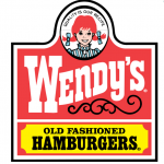
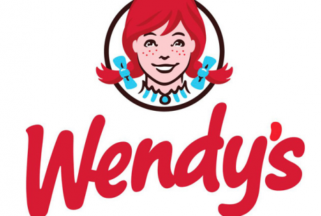
After 29 years, Wendy’s logo has gotten a makeover. The Wendy icon (inspired by founder Dave Thomas’ daughter at age eight) with it’s western feel and rigid panels are gone, in favor of a freer look with a softer script font, brighter color red, and flipping pigtails that bust out of the logo’s frame.
Take note, though..that Wendy’s’ did not totally abandon their previous look. After all, there is tremendous equity in their old logo design, which you would never want to just walk away from. They respected the brand’s rich heritage and equities and made it more contemporary.
You can do the same thing. You can take your old logo design and give it a fresh new appeal, just like Wendy’s. If you would like us to evaluate your current branding and give you some suggestions to improve upon it, give us at call (914) 582-9353


