Logo Re-Fresh for Local Brand
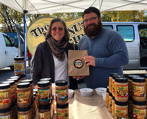
At a local Farmer’s Market, we met Joe Campagna, founder of the Peanut Principle,a gourmet & diverse line of Nut Butter products. After sampling several flavors, we were extremely impressed with the tastes, textures & uniqueness of Joe’s products. WOW! … we exclaimed & we proceeded to inquire as to how Joe’s brand was performing?
The Peanut Principle is not only sold locally at Farmer’s Markets, but has been successful enough to make it to the store shelf in notable locations such as Whole Foods & Mrs. Greens. So … Joe indicated that business was pretty good, but he did have a branding problem.
So, what’s the problem?
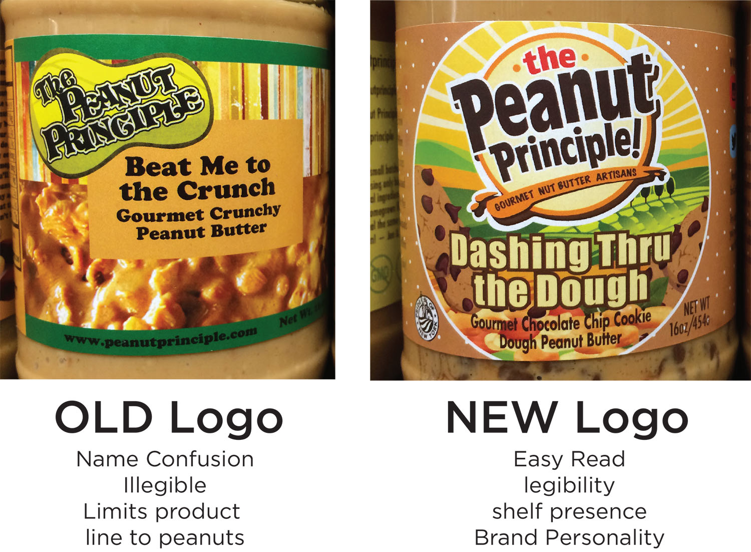
The Peanut Principle brand mark was confusing, not easy to read & lacked shelf presence. Hudson Valley Graphic Design understands the importance of brand presence in the marketplace & how to position brands to not only be noticed at shelf, but also tell a Brand story. No matter how good your product is, the need for having a positive brand impression is critical. Currently, The Peanut Principle lacked one & in a sea of competitors, needed to break through and have a point of difference.
After consulting with Joe on his brand personality & attributes, Hudson Valley Graphic Design provided a wide range of concepts for Joe to analyze & ultimately select. It was a tough choice for him, as HVGD’s solutions all have a distinct Brand story behind them.
The Winning Result Increased Sales
The winning result was a strong bulls-eye graphic that showcased The Peanut Principle brand name in a “stamp of quality” fashion. The rich, dark brown coloration of the logo face portrays naturalness & the “east to read” letterforms create maximum brand impression. The playful, jogged letterforms jump off the clean bulls-eye shape, breaking out & making a bold statement, yet displaying the sense of a quality product that consumers can trust.
The logo face is underscored with a graphic splash of peanut butter, reinforcing its product proposition & making the expert claim of “Gourmet Nut Butter Artisans”. This was a benefit call-out that was never leveraged before. Now, consumers can appreciate that time, care & quality ingredients went into the making of The Peanut Principle product. On pack, the new logo is prominently positioned front & center, surrounded by a tasty visual and fun & quirky flavor names. The strong branding unifies the many flavors into a cohesive family that is shoppable & noteworthy.

As the new look for The Peanut Principle has rolled-out, it not only has great brand impression at shelf, but separates itself from competitors with a new brand story…Local, gourmet, artisanal, fun & the experts in the Nut Butter experience!