Hendrick Hudson Free Library NEW Brand Look!
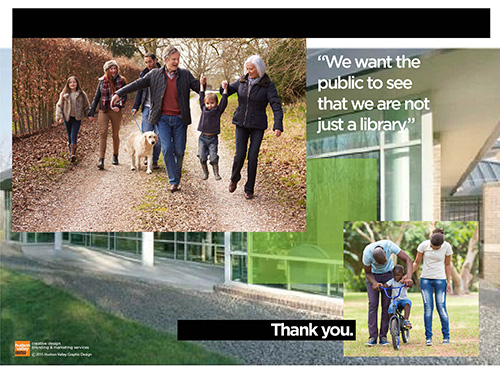
Jill Davis, Director of the Hendrick Hudson Free Library approached us to rebrand the image, personality & tone of the Hendrick Hudson Free Library with the objective of “reaching out to more people”. They needed a brand strategy to move forward. Awareness of the Library & all of its wonderful Community activities could improve. With so much to offer beyond traditional libraries, how could we connect to this Community in a new, fresh, exciting way – getting the message of HHFL out?
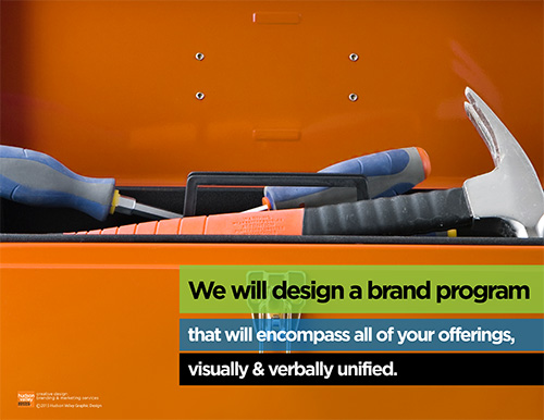
Hudson Valley Graphic Design is an expert in creating brand connections with people through optimal visual & verbal communication. A Brand Program that identifies with this Community & unifies all of HHFL’s many offerings became our mission.
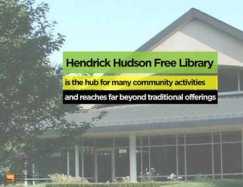
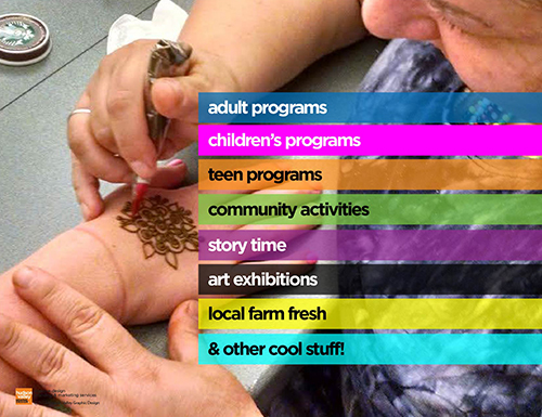
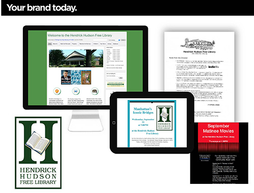
Our first step was to take a look at how their brand looked today, how their message was currently getting out. We presented our client with a brief visual overview of their present brand persona.
Brand Strategy Session
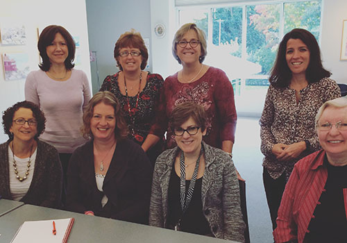
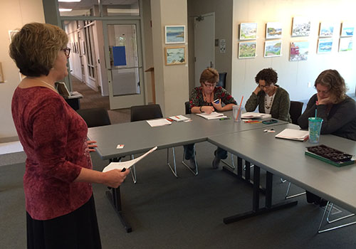
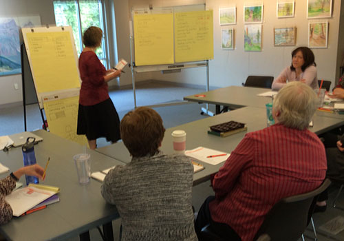
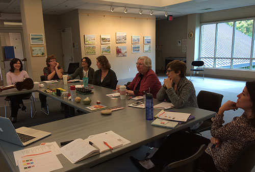
Through a thoughtful & inspirational brainstorming session with Jill & key leaders of the HHFL team, we collaboratively drew out ideas that would achieve this vision for the future. Multiple solutions, with range of rationale, were created for the team to analyze & ultimately select. This is a testimony to our belief & values in closely working with our clients & forming strategic partnerships.
We enjoyed a fun morning sharing ideas and input. All ideas are valid and welcome at our strategic brainstorming sessions, complete with worksheets and other surprises!
New Brand Look!
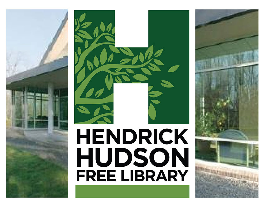
It was an obvious, winning solution when the entire team was unified in choosing a clean, modern system that built off the concept of growth, diversity & possibility. The branded look that achieved this builds from a key brand hub – HHFL’s initial letter “H”, which became a brilliant green icon that houses a free-form vine of moving leaves.
This positive image & coloration symbolized the concept of potential growth for all individuals and the positive association of HHFL’s outreach & resourcefulness to the Community. With the extended vine (service & support) & the abundant leaves (offerings & activities), the new visual identity completed the connection desired by HHFL. A strong HHFL logo-mark integrates with all of this, exuding the confidence & trust in a very professional Library organization. Your Logo design is your brand’s key communicator.
A Visual System
Complimenting the core icon “H” & its vine are a series of vibrant, multi-colored offerings with unique & fun motifs identifying HHFL’s offerings in easy-to-navigate mastheads. This ranged from Adult, to Teen, to Kids and beyond. HHFL has something to offer for everyone, all unified under one house, but with distinct personality for those audiences.
This Brand Visual System holds together as a family of offerings that are memorable, appealing & relevant to the eye of today’s on-line audience, establishing HHFL as the leader in contemporary Library offerings to local Community & beyond. Future growth for HHFL and the diverse Community it serves is bright & filled with opportunity & innovation.
